- Check it out in an example survey!
- Add a survey with tooltips to your account!
Adding explanatory text to a survey to ensure your respondents are on the same page is an excellent survey best practice. Trouble is, too much text can be fatiguing.
Using this handy trick, you can provide respondents hover-over tooltips throughout your survey with definitions and explanatory text. This way, the respondent can access the text if they need it but is otherwise hidden from display.
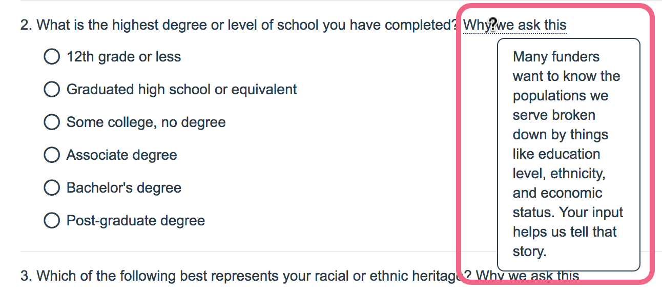
In this example, we are also demonstrating another survey best practice; providing respondents information as to why survey questions that could be considered sensitive are being asked.
Option 1. Basic Tooltip
This basic tooltip can be added to question text and Text/Instructions ONLY. If you wish to include tooltips in your answer options see Option 2 below.

- Start by copying the code below.
<a href="#" title="This text will display in the tooltip pop-up">Tooltip Text</a> - Next, edit the text instructions or question title where you want to include the hover-over tooltip.
- In our example, we are adding the instructional text to the Additional Instructional Text field under the Layout tab so the tip is not included in question titles in Reports and Exports. To set this up edit your question and go to the Layout* tab. Click into the Additional Instructional Text field and then click the Full Mode icon on the editor toolbar.
*The Layout tab is not available at all plan levels, however this solution can be implemented on the Question tab as part of the question text.
- Then click the Source icon on the editor toolbar.

- Paste in the copied code and update the text to meet your needs.
- Save the question.


Option 2. Styled Tooltips
In this example we'll be setting up a hover-over tooltip within the question text. You can take this code and apply it throughout your survey, e.g. within text/instruction elements, question instructions, answer options, etc.
- Start by adding the styles for the tooltips to the theme of your survey. These are required for the tooltips to work. To do so, go to Style tab. Scroll to the bottom of the survey preview to access the link to the HTML/CSS Editor. Paste the below CSS on the Custom CSS tab. If you wish you can customize the colors of your tooltip by changing hex codes for the color and border highlighted in red below.
/*** Tooltips! ***/ .tip { border-bottom: 1px dotted [template("base font color")]; position: relative; cursor: help; text-decoration: none; color: inherit; } .tip span { display: none; z-index: 100; position: absolute; padding: .6em; padding-left: 1em; top: 1.5em; left: 2.4em; width: 10em; background-color: [template("page background color")]; border: 1px solid [template("base font color")]; border-radius: 0.5em; } .tip:hover span { display: inline-block; } .sg-question-set, .sg-type-radio ul.sg-list-vertical li, .sg-type-checkbox ul.sg-list-vertical li, .sg-question-options, .sg-type-radio-likert .sg-question-options, .sg-type-table .sg-question-options, .sg-instructions { overflow: visible; } - Next, copy the below code.
<a href="#" class="tip">Tooltip Text<span>This is the text that will display in the tooltip pop-up.</span></a> - Edit your question.
- Click the Full Mode icon on the editor toolbar.
- Then click the Source icon on the editor toolbar.
- Paste the copied code wherever you would like to place your tool tip.
- Next, you need to customize the various pieces of the code:
- Start by replacing the Tooltip Text. In our above example we used "Why we ask this." This could also just be a ? at the end of a term if you wish.
- Next replace the text between the span tags with the info you wish to provide on hover/click.
In our example we end up with the code below:<a href="#" class="tip">Why we ask this<span>Many funders want to know the populations we serve broken down by things like education level, ethnicity, and economic status. Your input helps us tell that story.</span></a>
- Finally, if you are using tooltips, we recommend adding instructions for how to use them at the beginning of your survey.


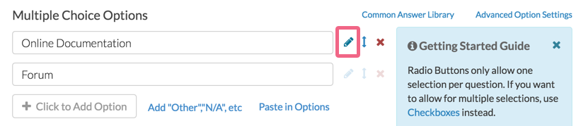
Best Practice: Adding Tooltips to Answer Options
When adding tooltips to answer options (available for styled tooltips only), follow these steps:
- Edit the answer option via the associated pencil icon.
- On the next screen, click into the Option Title field and click on the ... icon to expand the HTML editor options.
- Next, click on the Source button and paste your HTML code into the Option Title field.
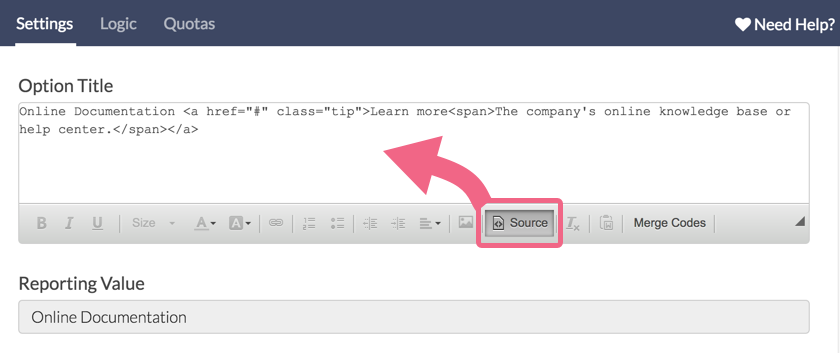
- Click Source a second time to exit the source code editor. Do this before you click Done in the step below.
- Click Done when you are finished.


Limitations
We do not have a built-in feature for hover-over tool tips. This workaround works for most of our customers in most cases but it is not a one-size-fits-all solution. This workaround is:
- only supported in survey themes built with the new theme builder.
- not supported on answer options utilizing click & drag functionality:
- Drag & Drop Ranking
- Closed Card Sort
- Open Card Sort
- Quick Sort
- may still require some tweaking to get it right depending on your theme and where in the survey you are using these tips.
- works best with 140 characters or less. If you wish to use more than 140 characters we recommend using Text / Instruction Elements, Page Descriptions or linking to a document with definitions and explanations.
- Quotation marks should be avoided within your tool tip text as they are a reserved character in HTML code.
Supported Browsers/Devices
These tooltips were tested on the following devices:
- Internet Explorer 7+
- Safari
- Firefox
- Chrome
- Android
- iOS
FAQ
How do tooltips work on mobile?
Only the styled tooltips will work on mobile. Respondents will have to click to reveal them as there is no hover action on mobile devices. As such, you might want to add a question mark in order to cue respondents to click.
If respondents interact with an answer option tooltip after having already selected that answer option (for example, within a checkbox question), the tooltip text will appear white against a white background. In this case, you may want to force the tooltip text to be a specific color.
To do so, locate color: inherit; within the styled tooltips CSS and replace inherit with a color of your choice, ex. color: black;.
Can I change the width/position of my tooltips on mobile?
This is possible with the addition of CSS code to the styled tooltips option.
This workaround works for most of our customers in most cases but it is not a one-size-fits-all solution. You may need to modify this CSS further depending on your theme and where in the survey you are using these tips.
Add the below CSS to the bottom of your styled tooltips CSS. Note that depending where you place your tooltip, you may see that it is pushed off the right side of the screen.
We recommend placing a line break <br /> directly prior to the tooltip code that you pasted into your question text, answer option, etc. on the Build tab.
@media only screen and (max-width: 500px){
  .tip:hover span {
    position: absolute;
    width: 19em; /*Adjust this value up/down to change the width of the tooltip box*/
    left: -2.3em; /*Adjust this value up/down to move the location of the tooltip left/right*/
  }
}
Can I add bullets to my tooltip text?
While the HTML for a bulleted list is not supported within the tooltip text, you can add bullets by using their HTML entities. Here is an example using • which is the HTML entity for a bullet. Learn more about HTML entities.
This solution is not compatible with simple tooltips. Use this with Option 2: Styled Tooltips.
<a class="tip" href="#">Why we ask this<span>Many funders want to know...<br />
• education level<br />
• ethnicity<br />
• economic status.<br />
<br />
Your input helps us tell that story.</span></a>Are your respondents having trouble figuring out how to close the tip on mobile devices?
Clicking outside the tooltip is all respondents need to do to close the tooltip on a mobile device. If this comes up frequently you can add the following code to your survey's theme.
Add the following additional CSS to the survey theme:
@media only screen and (max-width: 500px) {

.close-tooltip {
  display: inline-block;
  float: right;
  padding: 0 0 5px 5px;
  font-size: inherit;
  font-style: normal;
  text-rendering: auto;
  -webkit-font-smoothing: antialiased;
  -moz-osx-font-smoothing: grayscale;
}
.close-tooltip:before {
  content: "\2716";
}
}
And the following JavaScript to the Custom <head> tab under Style > HTML/CSS Editor:
<script>
$(document).ready(function() {
    var $tooltip = $('.tip');

    $tooltip.find('span').prepend('<i class="close-tooltip"></i>');

    $tooltip.on('click', function(e) {
        resetState(e, $(this));
    });

    $tooltip.on('hover', function(e) {
        resetState(e, $(this));
    });

    function resetState(e, o) {
        if ($(e.target).is('span')) {
            e.preventDefault();
        } else if ($(e.target).is('i')) {
            o.find('span').hide();
        } else {
            o.find('span').css({ 'display': '' });
        }
    }
});
</script>
— Mike.cordeiro on 06/12/2020
@Michael: Thanks so much for reaching out to SurveyGizmo Help!
At this time Hover Over Tooltips is not compatible with Image (multi-select) answer options using the documented method listed above. This may be possible if you have access to a programmer to create this interaction!
I hope this helps clarify!
Mike
Technical Writer
SurveyGizmo Learning and Development
— OPCC on 06/12/2020
Can hover over tool tips be used on multiple choice image questions?
Admin
— Dave Domagalski on 06/18/2019
@Zeb: Thank you for your question!
I'm sorry for the trouble! What you have described leads me to think that there might an HTML issue that is causing the text to be cut off.
Our Support team may be able to take a look and offer some suggestions for next steps. Please don't hesitate to reach out:
https://help.surveygizmo.com/help/surveygizmo-support-hours
I hope this helps!
David
Technical Writer
SurveyGizmo Customer Experience
— Samantha on 06/17/2019
I have tried entering the code for the stylelized tool-tips in the layout tab, and have put the CSS on the style sheet, but what is displayed is less than the first line of text. I have done this on a couple of different browsers - what could be causing this?
Admin
— Dave Domagalski on 03/22/2019
@Paia: Thank you for your notes!
I'm sorry for the trouble due to the lack of clarity in the article. I have since updated the content to include mention of the limited access of the Layout tab.
I'm glad to hear that you found a solution, and thank you for taking the time to share this with us!
David
Technical Writer
SurveyGizmo Customer Experience
— Paia on 03/21/2019
Please (partly) ignore my previous comment - and I would like to apologise for the gruffness of my previous comment. Since the pricing model was adjusted, some useful features that are beyond Explorer are now quite out of reach, which is a source of frustration...
I was able to work this one out, but the Screenshot in the article above, Option 1, Step 3. does indeed _not_ work for Explorer subscriptions anymore as the Layout tab is locked. This can be overcome, however, by switching to Source Code directly in the editor for a question's text. (Essentially as outlined in Option 2 above.)
— Paia on 03/21/2019
The text box on the right says that this is available on an Explorer license. It would seem that is _not_ the case. Very frustrating.
Admin
— Dave Domagalski on 05/16/2018
@Luke: Thank you for your note!
I'm afraid that this documented workaround is not currently compatible with answer options in Drag & Drop questions (as well as answer options in other questions using the drag & drop functionality).
I have since documented this limitation. I'm sorry for the trouble that this has caused.
We will explore options for updating this workaround code and will update this content if a better solution is found.
Thank you again and my apologies for the limitation.
David
Documentation Specialist
SurveyGizmo Customer Experience
— Luke on 05/16/2018
Hi, useful article. However, I am having a problem using tool-tips in the options for drag and drop question options. When you click on the tool-tip the whole option disappears from the list. Do you know of any solutions to this problem? Thanks
Admin
— Bri Hillmer on 03/07/2018
@Germán: Indeed you can! The same code can be added to an answer option in order to add a tooltip!
Bri Hillmer
Documentation Coordinator
SurveyGizmo Customer Experience Team
— Germán on 03/07/2018
Hi Bri, nice article! I was wondering if there is a way to add a hover over tooltip to an answer option (explaining them, like on dropdown lists or on checkboxes)
Thanks!
Admin
— Bri Hillmer on 09/07/2017
@Matthew: Soon! We have a fix that is waiting for our QA team to test. I'll reach out via email to let you know!
Bri Hillmer
Documentation Coordinator
SurveyGizmo Customer Experience Team
— Matthew.phillips@blackdog.org.au on 09/07/2017
any idea when this will be corrected? looking to go live with a survey, but may need to change my approach if the tooltip feature is still unavailable
Admin
— Bri Hillmer on 09/05/2017
@Matthew: Thank you for the heads up! We made some improvements to survey taking for accessibility and this seems to have botched the CSS for the styled tool tip. We're working on updating the documented CSS accordingly. I'll reach out to you via email once I have something!
Bri Hillmer
Documentation Coordinator
SurveyGizmo Customer Experience Team
— Matthew.phillips@blackdog.org.au on 09/04/2017
Tool tips seem to have changed...
Previous tool tips in the question are no longer shown, you now need to scroll down which does not look right.
Admin
— Bri Hillmer on 06/20/2017
@Matthew Phillips: I'm glad you found a solution to the navigation to the top of the page. We typically use the below JavaScript to solve this problem but I will do some testing and document what you have found as this seems like an easier solution.
JavaScript code to prevent navigation to the top of the page when href is clicked (Add to the survey via a JavaScript Action):
$('.tip').click(function(e) {
e.preventDefault();
});
As far as the scroll bar you describe, I am unable to replicate this problem. I put a tool tip on the last answer option of a question, as well as, at the end of the question text and it displays over top of the later question.
If you continue to run into this trouble I would recommend reaching out to our support team so that they can look at your specific survey.
Bri Hillmer
Documentation Coordinator
SurveyGizmo Customer Experience Team
— Matthew.phillips@blackdog.org.au on 06/19/2017
removed the href = "#", no longer goes to top of the page
Only other question is when a tooltip is at the bottom of the question, it forces the question to have a scroll bar and doesnt not fit on the page well.
Is it possible to expand the question to include the full tooltip box (not adding a scroll bar)
— Matthew.phillips@blackdog.org.au on 06/19/2017
Hi,
Helpful, however when I click on the tooltip box it takes me to the top of the screen.
Can I turn this off?
Admin
— Bri Hillmer on 03/17/2017
@Rlarkins: These tooltips will definitely work on mobile. Respondents will have to click though to reveal them as there is no hover action on a mobile device. As such, you might want to add a question mark in order to queue respondents to click.
I hope this helps!
Bri
Documentation Coordinator
SurveyGizmo Customer Experience Team
— Rlarkins on 03/16/2017
Can someone give guidance about how to make Hover-over text appear on a mobile?